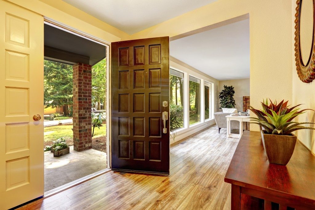
It’s easy to design a space when the space is the typical, the square-type of living room or bedroom, with neat, unobstructed corners. But unfortunately, that’s not the situation most homeowners find in their homes. What you have long, narrow spaces, small nooks at one part of a wall, areas with slanted ceilings, and the list goes on. What do you do with these awkward rooms? Simple. You embrace the awkward. Here are some design tricks for tricky spaces:
Narrow hallways
People tend to overlook these transition areas precisely because they’re just that, transition areas. But when they’re done with all the rooms in the house, they realize that this bare space is an eyesore. It’s boring. And worse, it’s a claustrophobia-inducing piece of boredom. So what do you do in such a space? Think of it as a gallery. A museum of some sorts. Use the walls in displaying your art pieces or photos. This avoids the monotony of blankness and instead make for a visually interesting area. If art isn’t your thing though, you can choose mirrors instead, so as to create the illusion of more space. For the bottom part of the walls, place a slim console table or a cabinet, if space will permit it. But if you want to draw the eyes upward and into the far end of the hallway, a nice lighting fixture will do the trick. Just avoid the dangling ones, as it will make the space narrower.
Corners with alcoves
You probably didn’t notice these architectural details when you bought the house, but now that you’re moving in the furniture, all you see is this ‘hindering sight.’ When you have these too-obvious features at home, the best approach is to emphasize them further, and not hide them away. So for instance, in the bedroom, nest your bed in it and make it the focal point of the room. In the kitchen, measure up the space, customize some cabinets or floating shelves, and fit them right in there. As you make that space your focal point though, know that this design move will affect how you do the rest of the layout of the room. You may need to rearrange furniture here and there, sometimes knock down some walls. Experts from Kansas City, kitchen remodeling specialists, highly recommend considering how you want to use the space so you can make the layout work best.
Long rooms
Typically, you want to have an evenly-spaced room, but sometimes what you get is a long living space or bedroom. What’s tricky here is how do you keep the visual interest through and through and reduce that overwhelming feeling of a stretched out area. The strategy here is to divide the space up. Dedicate different zones. For instance, in the living room, you can have a fireplace area, a reading nook in one corner, and then the formal living space occupying the bigger chunk. Use different area rugs to define these zones further. Do make sure though that you only have one focal point so the whole thing won’t look cluttered and random.
Embrace the Awkward

It’s not easy to design tricky spaces, but one thing’s for sure: embracing the awkward can mean plus points for your interior’s visual appeal. So instead of downplaying those corners and irregular shapes, highlight them.

